temperature records? It should be quite easy to do and really drive home the point. I wonder why they don't do that?
I don't know if I find these articles funny, or scary. But WHAT IS scary is that all of the fact checking websites claim to discredit them, without providing any proof. They simply say that the NOAA doesn't manipulate data.
You claim that those challenging the allegations of fraud never provide proof, in direct response to a post that DID provide just that. Follow my second link. At the bottom I show where I download the raw land temperature data myself and compute a global temperature record:

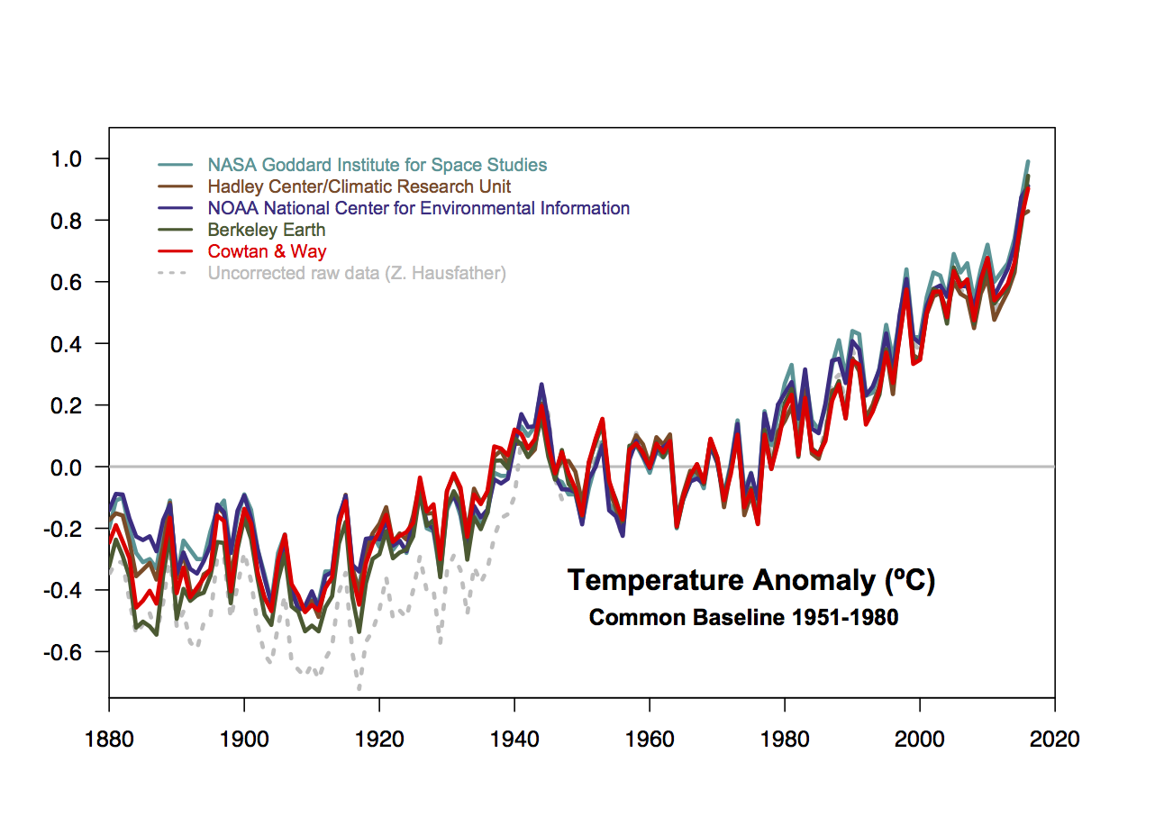
One of those curves is mine, using just the raw data without any kind of adjustments, the other is from the Berkeley Earth group, one of the other major groups that computes global temperature records. I'll leave it to the reader to guess which is which since they are so close it doesn't even matter.
But we can do even better. Remember that hypothetical plot I referenced in my post title? Turns out such comparisons are all over the place, your website just didn't show it becuase it completely contradicts the narrative of fraud that they are trying to push. Adjustments to the temperature record REDUCE the warming trend. Why would they do that?
Everything you ever wanted to know and more can be found at this highly recommended link:
Hopefully that alleviates your fears.